Friday, July 23, 2010
LAB 5
Thursday, July 8, 2010
LAB 3

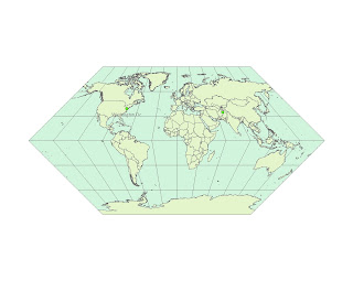
Eckert Map 1


This map projection activity was extremely enlightening for me because I was accustomed to viewing the world from a Cylindrical perspective. Toying around with the various perspectives stored in ArcMap shocked me and allowed me to truly grasp the shape of the earth and its properties.
A great aspect of this activity is that it clearly demonstrates how all map projections distort the surface represented in some fashion. While some distortions are acceptable, others are not. This was obvious with maps such as the Cube (not included in the blog) which’s projection couldn’t even allow me to calculate the distance between Washington D.C. and Kabul, Afghanistan. Because the Earth’s shape is irregular, although we like to think it’s spherical or ellipsoidal, information is already lost when creating a new map projection. The projection surface also distorts the image.
For example, the Miller Mercator Map is cylindrical projection. The negatives of such maps is that they stretch distances east-west. Furthermore with this specific map, the north-south stretching (a unique characteristic for identification in this category) grows with latitude and less quickly than the east-west stretching. The Mercator map also belongs in this group (Cylindrical) yet its specifics are such that the north-south stretching is equal to the east-west stretching. Thus both of the scales match. The cylindrical Mercator does, however, distort areas excessively in high latitudes.
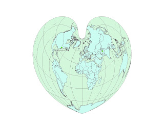
I think the most “distorted” projection, in my eyes, was the Bonne. In fact, I was delighted that a map could resemble a heart and, although quite interesting to observe, I found out that this projection has its specific purposes as well. I learned that the Bonne projection is a pseudoconical equal-area map projection and that parallels of latitude are concentric circular arcs. The obvious pitfall of this map is that the general population would have a difficult time reading it and grasping what its purposes and uses come to be. Although the map is from the conical group/category, the distortion of specific locations, such as Antarctica, Australia and Russia, would baffle most of the public.
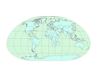
The second pseudocylindrical map projection I chose was the Loximuthal because, quite frankly, it looked like a sand bag one squeezes to relieve stress (no mockery intended). I learned that from the central points, rhumb lines are shown as straight, true to scale, and correct in azimuth from the center. However, this projection is available only for the spherical geoid. The map is somewhat ambiguous as distortion varies from moderate to extreme which can easily trick the untrained average human eye.
Then again, different maps are used for different purposes. Map projections carry great potential because anyone (regardless of purpose, education and profession) could use one, or more, to either suit his needs to learn something new. With the Aitoff Map, I understood that the shape looks like a slightly squeezed Earth because it is a azimuthal equidistant projection. As we learned in class, equidistant projections accurately preserve the distance between two objects. In this case, all distances measured from the center of the map along a longitude line are accurate. Such projection is great for large scale mapping. Airlines, radio and others also use this projection. However, this projection is very inconvenient because in order for distances to be correct, they must be between points along straight lines. Not only are other distances incorrect, but the further one moves from the center point the more the areas and their shapes become distorted.
Map projections are needed and useful because maps, unlike GIS, are static and this only one map with one projection could never serve the multiple needs and purposes that we humans assign to them. This is one of the reasons I also wanted to display an orthographic projection in the form of the Behrmann Projection. With it, three-dimensional objects are represented in two-dimensional ways. I found that the map, although equal area, distorts shapes as they part from the standard parallels. Thus as you can see, the northern part of earth, seems squished as if the topographer ran out of room. The Eckert Map, on the other hand, may be amusing but also shows an equal-are with poles and central meridians at half length of the equator.
I think the major pitfall of these projections is that although deemed universal, they can barely be interpreted and understood by the general public. This, in turn, is where the beauty of map projection arises: professionals skillfully manipulate specific types of projections to efficiently perform their duties (such as pilots and captains). It would be beneficial if more people were aware of these distortions and possibilities because through the sampling of these projections, the viewer becomes exposed to the diversity of the earth and may expand his understanding of his own planet.


