Friday, July 23, 2010

LAB 5

SPATIAL ANALYSIS
Questions and Answers


1.) How many counties are there in Iowa State?
1.) There are 99 counties in Iowa State.


2.) Which county in Georgia contains the largest number of people, as of the year 2001?
2.) Fulton County has the largest number of people in Georgia.


3.) How many cities, with populations greater than 15,000, are located within the states of Washington?
3.) There are 85 cities with a population greater than 15,000 within Washington State.


4.) How many miles long are all of the interstates that are crossed by the outlines of Los Angeles County?
4.) 58.667641 + 2363.5916 + 1357. 0795


5.) Simplify Urban areas of Los Angeles County. How many acres are they?
5.) 50238.516 + 1220379.1 (some of this is from Orange)


6.) How many zip codes have their centroid in LA County?
6.) UNKNOWN


7.) Provinces of Canada


8.) Which Native American Indian Reservation lie within 75 miles of the City of Thurso in Quebec, Canada?

8.) Kahawake Indian Reservation, Doncaster Indian Reservation, Kitigan Zibi Indian Reservation, Akwesasne Indian Reservation, and Kanesatake Indian Reservation.

Thursday, July 8, 2010

LAB 3


MAP PROJECTIONS IN ArcGIS
* Click on each image for better viewing.


GCS WGS 1984 Map


Disatnce from DC to Kabul: 6,974.245519 Miles


Mercator Map


Distance from DC to Kabul: 10,165.802196 Miles


Miller Cylindrical Map


Distance from DC to Kabul: 10,087.704526 Miles


Eckert Map 1


Distance from DC to Kabul: 7,384.71822 Miles


World Gall Stereographic Map


Distance from WA DC to Kabul: 7,114.224274 Miles


Behrmann Map


Distance from WA DC to Kabul: 8,786.05699 Miles


Aitoff Map


Distance from WA DC to Kabul: 8,562.003092 Miles


Bonne Map


Distance From WA DC to Kabul: 6,729.180872 Miles


Loximuthal Map


Diatance from WA DC to Kabul: 7,900.498339 Miles


This Assignment

This map projection activity was extremely enlightening for me because I was accustomed to viewing the world from a Cylindrical perspective. Toying around with the various perspectives stored in ArcMap shocked me and allowed me to truly grasp the shape of the earth and its properties.

A great aspect of this activity is that it clearly demonstrates how all map projections distort the surface represented in some fashion. While some distortions are acceptable, others are not. This was obvious with maps such as the Cube (not included in the blog) which’s projection couldn’t even allow me to calculate the distance between Washington D.C. and Kabul, Afghanistan. Because the Earth’s shape is irregular, although we like to think it’s spherical or ellipsoidal, information is already lost when creating a new map projection. The projection surface also distorts the image.

For example, the Miller Mercator Map is cylindrical projection. The negatives of such maps is that they stretch distances east-west. Furthermore with this specific map, the north-south stretching (a unique characteristic for identification in this category) grows with latitude and less quickly than the east-west stretching. The Mercator map also belongs in this group (Cylindrical) yet its specifics are such that the north-south stretching is equal to the east-west stretching. Thus both of the scales match. The cylindrical Mercator does, however, distort areas excessively in high latitudes.

I think the most “distorted” projection, in my eyes, was the Bonne. In fact, I was delighted that a map could resemble a heart and, although quite interesting to observe, I found out that this projection has its specific purposes as well. I learned that the Bonne projection is a pseudoconical equal-area map projection and that parallels of latitude are concentric circular arcs. The obvious pitfall of this map is that the general population would have a difficult time reading it and grasping what its purposes and uses come to be. Although the map is from the conical group/category, the distortion of specific locations, such as Antarctica, Australia and Russia, would baffle most of the public.

The second pseudocylindrical map projection I chose was the Loximuthal because, quite frankly, it looked like a sand bag one squeezes to relieve stress (no mockery intended). I learned that from the central points, rhumb lines are shown as straight, true to scale, and correct in azimuth from the center. However, this projection is available only for the spherical geoid. The map is somewhat ambiguous as distortion varies from moderate to extreme which can easily trick the untrained average human eye.

Then again, different maps are used for different purposes. Map projections carry great potential because anyone (regardless of purpose, education and profession) could use one, or more, to either suit his needs to learn something new. With the Aitoff Map, I understood that the shape looks like a slightly squeezed Earth because it is a azimuthal equidistant projection. As we learned in class, equidistant projections accurately preserve the distance between two objects. In this case, all distances measured from the center of the map along a longitude line are accurate. Such projection is great for large scale mapping. Airlines, radio and others also use this projection. However, this projection is very inconvenient because in order for distances to be correct, they must be between points along straight lines. Not only are other distances incorrect, but the further one moves from the center point the more the areas and their shapes become distorted.

Map projections are needed and useful because maps, unlike GIS, are static and this only one map with one projection could never serve the multiple needs and purposes that we humans assign to them. This is one of the reasons I also wanted to display an orthographic projection in the form of the Behrmann Projection. With it, three-dimensional objects are represented in two-dimensional ways. I found that the map, although equal area, distorts shapes as they part from the standard parallels. Thus as you can see, the northern part of earth, seems squished as if the topographer ran out of room. The Eckert Map, on the other hand, may be amusing but also shows an equal-are with poles and central meridians at half length of the equator.

I think the major pitfall of these projections is that although deemed universal, they can barely be interpreted and understood by the general public. This, in turn, is where the beauty of map projection arises: professionals skillfully manipulate specific types of projections to efficiently perform their duties (such as pilots and captains). It would be beneficial if more people were aware of these distortions and possibilities because through the sampling of these projections, the viewer becomes exposed to the diversity of the earth and may expand his understanding of his own planet.

Wednesday, June 30, 2010

LAB 2B


Airport Map

Click on each image to enlarge for viewing.


Map 1: Step One Completed


Map 2: Phase 2 Completed


Map2: Phase 3 Completed


Map4: Phase 4 Completed


FINAL MAP: Tutorial Completed


ANALYSIS OF AcrMap EXPERIENCE

This lab introduced me to ArcMap as I plunged into a tutorial illustrating the numerous possibilities incorporated in the software’s data. While constructing the airport maps, I became somewhat familiar with the basic functions of GIS and finally began to understand what he program does and how it’s tools aid geographers. Once the project was complete, apart from feeling proud of myself (I did spend a good 8 hours getting to know the program), I understood how GIS could be used by anyone and how vital it is for our society.

The biggest potential of GIS and ArcMap would be the tool bars, cursors, options and hundreds (if not thousands) of controls which the user has available to manipulate while working on his/her map. This allows the maker to fully customize the end result and fine-tune it so it suits the purposes as hand. With this activity, for example, I was able to show not only the noise level areas, the schools, the roads and the overall surrounding area affected; I was also capable of making a graph as well as “zooming” out and demonstrating the whole county and geographic location of the project. Thus GIS makes it easy for the viewer to quickly grasp the content before him/her and analyze the data intelligently.

I was also impressed with the system’s ability to incorporate and store statistical data. I do, however, think that this could be a potential pitfall as greater generalization may be made about a certain geographical area. Since statistics can never be 100% accurate and sometimes comes out quite faulty, GIS may not always produce an accurate. Yet as we learned in class, because the system can always be updated and information can always be changed, these mistakes can swiftly be altered for the better.

Thus far, I find the software intimidating and fun. The potential to store so much information and then neatly and cohesively display it so the average person understands the “bigger picture” is amazing. I do think that the program is honed for specialists, as would be in any given field and its tools, because I struggled immensely throughout the tutorial and, noting all the sighs and raised hands for help, so did the rest of the class. GIS may be a tool which could only be truly used with its maximum potential via professionals. I liked that when placing the mouse over any function a description would pop up. Even so, the average “Joe” would have a tough time using the software.

In this lab I understood that GIS is broadly used by all professions on a daily basis. Never having heard or used the software before, I was surprised that with enough effort I too could create a pretty neat looking poster with valuable information pertaining to a certain land area. I’m anxious to see what is next in this new section of the world of geography. In time, I hope that I will confidently use ArcMap and have the competence to carry on a conversation with a professional in this field. I also hope that my map skills and overall orientation of location greatly improve.


Tuesday, June 29, 2010

LAB 2A


HIV/AIDS in Africa

INTRODUCTION:
This map concerns itself with the origination and spread of HIV from Africa. The first transfer from monkey to human is believed to have occurred in the 1940s in Guinea-Bissau.The SIV (Simian Immunodeficiency Virus) appeared in colonies of chimpanzees in the south-east Cameroon region in the 1930s. Thus each cite is marked with the date of infection (approximate) and the current state of its inhabitants.
The most infected regions have been marked with detailed statistical information in regards to the affected victims, their gender and age group and their financial status.
Although the information used for this project was attained from http://www.avert.org, I have also posted videos, courtesy to www.youtube.com which provide further detail of the mystery of the disease and the absence of information we have about it.


View HIV/AIDS in Africa in a larger map


NEOGEOGRAPHY:

This project aided my understanding of neogeography as I personally experienced the excitement and possibilities of making my own map. Throughout the making of this map, I diligently utilized the internet as my tour guide. I found neogeography to be empowering for both mind and soul, respectively, because I was simultaneously intellectually and artistically challenged. Google maps’ pre-existing map was extremely easy to navigate and manipulate.

I think neogeography makes the world more accessible and homey since all have the potential to include their personal experiences, opinions, and essentially guide others to their favorite spots. It’s a door to people’s somewhat private lives as one may see the world of a total stranger and consequently map out his/her experience to make a new map. In this way, no longer do we have to be experts in order to take a vacation to Yosemite National Park; all we need is Google Maps and the help of some distant friends who are generous and willing to show us all the best camping spots, hikes and waterfalls.

With my project, I think neogeography can be taken much further as an educational tool for various age groups, social classes and so forth. I chose to map out the beginning of the worst epidemic in the twenty-first century precisely to test this theory. Although it may not be perfect, my map can quickly orient the viewer and give her/him a visual perspective where in the world HIV was contracted and how the spread began geographically. However, I also think that a pitfall could be interpreted even from a simple map as mine since I am no expert on this issue and, although I stayed within what I believe to be credible sources, have little authority to educate anyone beside myself.

Overall, neogeography is useful to much of the population because a map made by an amateur, like myself, is usually easier to read and more accessible than a map made by a professional, such as a topographic map. In the educational realm and business world, these maps could also prove useful as medical researchers and CEOs, bankers to church officials could all apply their knowledge of a given piece of land to educate or aid their fellow colleagues or the greater community.

Wednesday, June 23, 2010

LAB 1B

some_text


COLOR KEY:
  • Questions
  • Answers

1. What is the name of the quadrangle?
1. The name of the quadrangle is Beverly Hills Quadrangle. (upper right corner of map)

2. What are the names of the adjacent quadrangles?

2. The names of the adjacent quadrangles are: 1. Canoga Park; 2. Van Nuys; 3. Burbank; 4. Topanga; 5. Hollywood; 7. Venice; 8. Inglewood. (bottom middle square)

3. When was the quadrangle first created?
3. The quadrangle was first created in 1995. (bottom right corner)

4. What datum was used to create your map?
4. The North American Datum of 1972 (NAD 27) was used to create this map. (bottom left corner)

5. What is the scale of the map?
5. The scale of the map is (fractional) 1:24 000 and thus 1 inch represents 24,000 miles or 2000 feet. (bottom middle where SCALE is indicated)

6. At the above scale, answer the following:
a) 5 centimeters on the map is equivalent to how many meters on the ground?
a) Five centimeters on the map would be equivalent to 1200 meters on the ground.
WORK: 1centi:24 ooocenti times 5 = 5centi:120,000centi; 1 meter=100 centimeters; 1meter/100centimeters = ?/120,000 (as fractions)

b) 5 inches on the map is equivalent to how many miles on the ground?
b) 1.8939 (repeating) miles
WORK: 1inch:24 000inches times 5 = 5inches:120,000inches. 1mile=63,360inches; 1/63,36000=120,000/?.

c) one mile on the ground is equivalent to how many inches on the map?
c)One mile on the ground would be equal to 2.64 inches on the map.
WORK: 63,360/24000=2.64

d) three kilometers on the ground is equivalent to how many centimeters on the map?
d) 12.5 centimeters on the map are equal to 3 kilometers on the ground.
WORK: 3kilometers= 300000meters/24000=12.5

7. What is the contour interval on your map?
7. The contour interval on the map is 20 feet. (bottom of map)

8. What are the approximate geographic coordinates in both degrees/minutes/seconds and
decimal degrees of:
a) the Public Affairs Building?
a) Public Affairs Building has the approximate geographic coordinates as: 34 degrees, 4 minutes and 26.17 seconds N Latitude; 118 degrees, 24 minutes and 20.75 seconds W Longitude; Decimal: 34.0739361 and -118.4057638.
WORK: minutes times 60seconds plus seconds (here) divided by 3600(seconds in hour) plus degrees gives answer; if it's W or S I negate the result.

b) the tip of Santa Monica pier?
b) 34 degrees, o minutes, 26.96 seconds N Latitude; 118 degrees, 29 minutes 59.22 seconds W Longitude; Decimal: 34.00748N and -118.499783.

c) the Upper Franklin Canyon Reservoir?
c) 34 degrees, 7 minutes and 12.55 seconds N Latitude; 118 degrees, 24 minutes, 37.03 seconds W Longitude.

9. What is the approximate elevation in both feet and meters of:
a) Greystone Mansion (in Greystone Park)?
a) Greystone Mansion has the approximate elevation of 620 feet and 188.976 meters.

b) Woodlawn Cemetery?
b) The Cemetery is 140 feet in elevation and 42.672 meters.

c) Crestwood Hills Park?
c) Crestwood Hills Park is at 636 feet elevation and 193.85 meters.

10. What is the UTM zone of the map?
10. The UTM zone of the map is 11. (bottom left block)

11. What are the UTM coordinates for the lower left corner of your map?
11. The UTM coordinates for the lower left corner of the map are

12. How many square meters are contained within each cell (square) of the UTM gridlines?
12. There are 10,000 foot ticks

13. Obtain elevation measurements, from west to east along the UTM northing 3771000,
where the eastings of the UTM grid intersect the northing. Create an elevation profile
using these measurements in Excel (hint: create a line chart). Figure out how to label
the elevation values to the two measurements on campus. Insert your elevation profile
as a graphic in your blog.
13. Unable to complete question.

14. What is the magnetic declination of the map?
14. The magnetic declination is 14 feet. (bottom, norths indicated)

15. In which direction does water flow in the intermittent stream between the 405 freeway
and Stone Canyon Reservoir?
15. The intermittent stream, marked with the dashes, between the 405 freeway and Stone Canyon Reservoir flows in the direction of upstream since there are "V" shape contours indicating this direction.

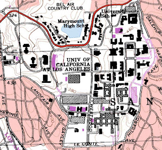
16. Crop out (i.e., cut and paste) UCLA from the map and include it as a graphic on your
blog.
16.

LAB 1A


GLOBAL PUBLIC LIBRARY USAGE


MAP1: This map was copied from www.walkingpaper.org. I'm not sure which exact year the statistics were published but discovered that UNESCO Institute of Statistics gathered the data. The territories and continents appear warped and significantly reshaped due to the subject of interest. In this case, each country represents the percentage of books borrowed from public libraries. I thought it was interesting that the most books were borrowed from Russia, Western and Eastern Europe and Japan. I also found it appalling that North America borrowed only .694 books per person for that year while the grand total average for borrowed books per person in the world is 1.160. The author who published this map, alongside its information, noted the statistical inconsistencies which he found amongst UNESCO and the Public Libraries of the United Sates: Fiscal Year 2004. Either ways, I decided to post this map because I found it interesting that much of South America and about a half of North America appear to have very little interest in literature. Although it may be argued that many people choose to purchase their reading materials, I initially thought, when I read the title of the original article, that poor countries whose residents cannot afford to buy books would opt to borrow them. From looking at the map, it is evident that Africa is almost nullified. This prompted me to question how many public libraries are available for Africans and how accessible they are to all people (lower, middle and upper class). From this map, I thought it would be interesting to see how much written literature there is in Africa and, perhaps, the reason for the absence of libraries is because the Vernacular, the verbal folktales, still dominate the culture there. Thus I don't think it's fair to portray Africans in such negative light when one considers how many of the tribal "languages" are verbal only and are not written down. Lastly, I'm not sure who lives in Siberia and how much reading they are doing. Perhaps I'm not understanding the map but unless the Polar Bears are keeping a great secret from us, I don't see how human beings could survive in those conditions, let alone think of recreational activities such as reading.


GDP WEALTH 2002


MAP2: I found this map on the website www.worldmapper.org as the Absolute wealth for the year 2002. It was interesting to compare to Map1 above because of the parallels and anomalies which occurred. GDP (Gross Domestic Product) appears most significantly in the Northern Americas and Europe. Western Asia seems to be third in size as an international purchasing power. The website also described that the size of the countries further indicates what someone's money would be worth if they decided to spend it in another territory. Overall, wealth per person was deemed highest in Luxembourg, Norway and Switzerland while lowest in Ethiopia, Burundi and the Democratic Republic of Congo. I suppose because of their notorious banking systems, these European countries thrive so well. I also assumed that due to Africa's malnourished, disease ridden and uneducated population, obtaining high annual capital had its challenges. Southern Africa most likely "stands out" from the rest of the continent due to its diamond exports. On the other spectrum of things, it was fascinating to partially assume that perhaps due to AIDS and Malaria wiping out whole villages and numerous members of the population, parts such as Ethiopia struggled immensely with GDP.
This map illuminates that, in 2002, Africa was the Dark Nation harboring three of the poorest, third world war, countries in the world. I think U.S.A.'s wealth and Africa's destitute somewhat clash with the map above. While both African and Southern America appear to be disinterested in reading, (at least from public libraries) it could be "weakly" argued that due to their impoverished states, the citizens are forced into manual labor. The domino affect plays a part as poor families work low wage jobs and thus stay within this closed circle where the possibility for their children attaining higher education and securing financially uplifting futures is frankly impossible. But I also found it interesting that USA, although deemed rich by this map, had almost the same size as S. America in terms of reading/borrowing library books. I think that this partly speaks of our culture and social tendencies (we tend to buy books rather than spend time at the library) and our education level and lack of competitive drive (for anything besides money). I'm tempted to conclude that, although they are old maps, I can see how our Capitalistic drive orients us towards money making and allows us to desert the Classical Arts, for example, as many Americans remain culturally inept and close minded.


GLOBAL COMMUNICATIONS TRAFFIC MAP 2005


MAP3: This map was extracted from the internet page www.http://ilikeellipses.com/2007/09/12/global-bandwidth-and-how-to-stop-it/. I chose this map because of its title: I know very little about technology and struggled with the term "internet bandwidth" so much that I had to first learn about it before I could "read" this map. Slightly more educated, I then understood that this map portrays the transmission speed of the internet connections in 2005. Thus America, shown with the greatest bandwidth, can transfer the most information (and receive I suppose). We have huge corridors connecting us with Europe and Asia but none connecting these two mentioned continents together. This is interesting to me because I didn't know these things mattered for a better connection to be established. According to the author of the webpage from which I copied this map, the U.S.A. has created a star topology. I think it's interesting that we are connected to everything and everyone, if we are to exclude Greenland/Iceland/Antarctica, etc. I suppose information flows freely from us and to us and thus we have fast internet connections.