GLOBAL PUBLIC LIBRARY USAGE
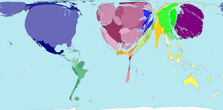
MAP1: This map was copied from www.walkingpaper.org. I'm not sure which exact year the statistics were published but discovered that UNESCO Institute of Statistics gathered the data. The territories and continents appear warped and significantly reshaped due to the subject of interest. In this case, each country represents the percentage of books borrowed from public libraries. I thought it was interesting that the most books were borrowed from Russia, Western and Eastern Europe and Japan. I also found it appalling that North America borrowed only .694 books per person for that year while the grand total average for borrowed books per person in the world is 1.160. The author who published this map, alongside its information, noted the statistical inconsistencies which he found amongst UNESCO and the Public Libraries of the United Sates: Fiscal Year 2004. Either ways, I decided to post this map because I found it interesting that much of South America and about a half of North America appear to have very little interest in literature. Although it may be argued that many people choose to purchase their reading materials, I initially thought, when I read the title of the original article, that poor countries whose residents cannot afford to buy books would opt to borrow them. From looking at the map, it is evident that Africa is almost nullified. This prompted me to question how many public libraries are available for Africans and how accessible they are to all people (lower, middle and upper class). From this map, I thought it would be interesting to see how much written literature there is in Africa and, perhaps, the reason for the absence of libraries is because the Vernacular, the verbal folktales, still dominate the culture there. Thus I don't think it's fair to portray Africans in such negative light when one considers how many of the tribal "languages" are verbal only and are not written down. Lastly, I'm not sure who lives in Siberia and how much reading they are doing. Perhaps I'm not understanding the map but unless the Polar Bears are keeping a great secret from us, I don't see how human beings could survive in those conditions, let alone think of recreational activities such as reading.
GDP WEALTH 2002

MAP2: I found this map on the website www.worldmapper.org as the Absolute wealth for the year 2002. It was interesting to compare to Map1 above because of the parallels and anomalies which occurred. GDP (Gross Domestic Product) appears most significantly in the Northern Americas and Europe. Western Asia seems to be third in size as an international purchasing power. The website also described that the size of the countries further indicates what someone's money would be worth if they decided to spend it in another territory. Overall, wealth per person was deemed highest in Luxembourg, Norway and Switzerland while lowest in Ethiopia, Burundi and the Democratic Republic of Congo. I suppose because of their notorious banking systems, these European countries thrive so well. I also assumed that due to Africa's malnourished, disease ridden and uneducated population, obtaining high annual capital had its challenges. Southern Africa most likely "stands out" from the rest of the continent due to its diamond exports. On the other spectrum of things, it was fascinating to partially assume that perhaps due to AIDS and Malaria wiping out whole villages and numerous members of the population, parts such as Ethiopia struggled immensely with GDP.
This map illuminates that, in 2002, Africa was the Dark Nation harboring three of the poorest, third world war, countries in the world. I think U.S.A.'s wealth and Africa's destitute somewhat clash with the map above. While both African and Southern America appear to be disinterested in reading, (at least from public libraries) it could be "weakly" argued that due to their impoverished states, the citizens are forced into manual labor. The domino affect plays a part as poor families work low wage jobs and thus stay within this closed circle where the possibility for their children attaining higher education and securing financially uplifting futures is frankly impossible. But I also found it interesting that USA, although deemed rich by this map, had almost the same size as S. America in terms of reading/borrowing library books. I think that this partly speaks of our culture and social tendencies (we tend to buy books rather than spend time at the library) and our education level and lack of competitive drive (for anything besides money). I'm tempted to conclude that, although they are old maps, I can see how our Capitalistic drive orients us towards money making and allows us to desert the Classical Arts, for example, as many Americans remain culturally inept and close minded.
GLOBAL COMMUNICATIONS TRAFFIC MAP 2005

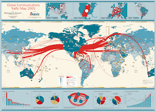
MAP3: This map was extracted from the internet page www.http://ilikeellipses.com/2007/09/12/global-bandwidth-and-how-to-stop-it/. I chose this map because of its title: I know very little about technology and struggled with the term "internet bandwidth" so much that I had to first learn about it before I could "read" this map. Slightly more educated, I then understood that this map portrays the transmission speed of the internet connections in 2005. Thus America, shown with the greatest bandwidth, can transfer the most information (and receive I suppose). We have huge corridors connecting us with Europe and Asia but none connecting these two mentioned continents together. This is interesting to me because I didn't know these things mattered for a better connection to be established. According to the author of the webpage from which I copied this map, the U.S.A. has created a star topology. I think it's interesting that we are connected to everything and everyone, if we are to exclude Greenland/Iceland/Antarctica, etc. I suppose information flows freely from us and to us and thus we have fast internet connections.

No comments:
Post a Comment